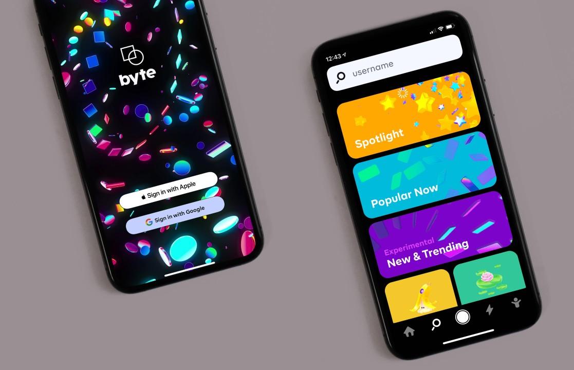
A phone is never a desk setup. The display is small, the surroundings are noisy, and users often divide their attention among messages, motion, and everything going on around them. That function, in turn, informs us of what “good design” actually is: users spend more time on a mobile app if it has a peaceful, approachable quality to it. Not because it is minimalist in design, but because it is frictionless. A busy layout demands constant scanning. It forces the brain to decide what matters, where to tap, and what will happen next. A simpler interface narrows the choices and makes outcomes easier to anticipate. That is why many mobile entertainment products, from streaming to instant games, lean toward a clean path: one goal, one main action, and feedback that arrives quickly. When the next step is obvious, attention goes to the content instead of the controls.
The hidden cost of “more stuff” on one screen
Crowded interfaces borrow attention before delivering value. The more banners, animations, and competing buttons, the longer it takes for a user to figure out what is safe to press. On a mobile screen, indecision for even a fraction of a second can cause a user to cancel and pursue an alternate option. Busy screens also create false urgency. Popups and flashing elements make it feel like something must be clicked right now, which can turn entertainment into stress. Simple interfaces avoid that trap by keeping the primary action visually dominant. Secondary options still exist, but they sit quietly in predictable places. That stability matters more than many teams expect. People return to apps that feel easy to “re-enter” without relearning anything. The best mobile layouts behave like a familiar room. Nothing jumps out. Everything is where it was last time.
Clear feedback beats decoration when time is limited
On a phone, attention is often measured in short bursts. The interface has to confirm actions quickly; the user assumes nothing happened. Clear feedback can be as basic as a pressed state, a short animation that signals progress, or a clean change in the main indicator. What matters is that feedback is immediate and easy to interpret. Visual decoration does not replace it. In fact, decoration often hides it. When gradients, particles, and extra motion fill the screen, the user misses the one signal that actually matters. A good example of readable feedback comes from fast formats built around a single visible indicator. In the first moments of the second screen section, it helps to reference how a simple rising value can guide attention. For pacing and clarity, the aviator india page shows a quick round structure where a multiplier climbs, and the result is resolved abruptly, so the viewer always knows what to watch and when the outcome lands. That kind of design works because the main element is obvious. The interface supports it rather than competing with it.
Fewer choices can feel more satisfying than unlimited options
Choice overload is real on mobile. Too many tabs, modes, and hidden menus push users into indecision. That indecision often looks like “boredom,” but it is usually just cognitive load. Simple interfaces reduce that load by giving one clear path and limiting decisions to a few moments that matter. Streaming apps do this by surfacing a primary play action and placing deeper browsing behind a scroll. Instant-game formats do it by presenting a single mechanic with quick rounds. Both are built around the same idea. The user should not have to plan. The experience should start smoothly, then provide small decisions inside the flow. When the interface forces a strategy at the entry point, attention gets spent on navigation instead of enjoyment.
Practical UI patterns that keep the screen readable
Mobile attention is easier to hold when the interface uses patterns that match how people scan. The eye looks for a primary object, then checks for a next step, then confirms progress. That sequence breaks when the layout is packed with equal-weight elements. A calmer layout uses hierarchy. It gives one main element the visual center. It keeps supporting controls consistent. It avoids motion that competes with the content. The following patterns show up again and again in apps that feel easy to use, even for first-time visitors.
- One dominant action per screen. Secondary actions stay smaller and quieter.
- Stable placement for navigation. Buttons do not move between screens.
- Predictable feedback. Taps trigger immediate, readable responses.
- Clear spacing. Elements breathe so the eye can separate them fast.
- Limited text on entry screens. Detail appears only when needed.
- Visual focus on one indicator. The main metric stays visible throughout.
These patterns work because they treat the phone as a constrained space. They also make the experience easier to resume after interruptions, which is common in real life.
A closing check that reveals whether an interface is truly simple
The fastest way to evaluate simplicity is to imagine a user returning after a day. If the entry screen still makes sense without a warm-up, the interface is doing its job. If it demands searching, reading, and guessing, it is closer to “busy” than it looks. Simple mobile interfaces are not empty. They are structured. They guide attention with hierarchy, reduce choices at the start, and deliver feedback quickly. For entertainment formats, that approach matters even more because the session is often short. Whether the app is used to stream an episode, clip a highlight, or open a quick round with a visible indicator, attention stays longer when the next step is obvious, and the screen does not compete with itself.
Leave a Reply